Notes from Designing UI book
DIRTY VERSION
Groups and Elements
visually similar objects = part of a group
strongest connecter between objects and groups is color first, size and shape next
alignment = connection between objects
symettery is king in ui design
'Similar types of content should always be aligned to the same edge. An out of place element breaking the continuity will naturally slow down our scanning.'
Sharp corners are slightly slower to process, as our eye has to pause and 90-degree turn on each side. A smoother, rounded edge will help our eye go around much faster.
Don't have too many objects
The more options to choose from (and the more complex they are), the harder it is to make a choice. (Hick's Law)
Our minds can only process around 7 (+/- 2) objects at the same time. (Miller's Law
While designing, try not to exceed seven options, and for optimal results, try keeping it between four and five. That means the number of main navigation items, number of buttons in a component, dropdown choices, or carousel slides. When giving the user choice, it's good to highlight the most popular or recommended option as well. It often leads to much faster decision making.
We instinctively differentiate between an object and a background.
You can use contrast, position, and shadows to help the user differentiate the foreground and the background.
Tip: You can use contrast, position, and shadows to help the user differentiate the foreground and the background.
The seriel position: First and last
We always remember the first and last object in a group best so the most relevant content or objects should always be placed either first or last in a group.
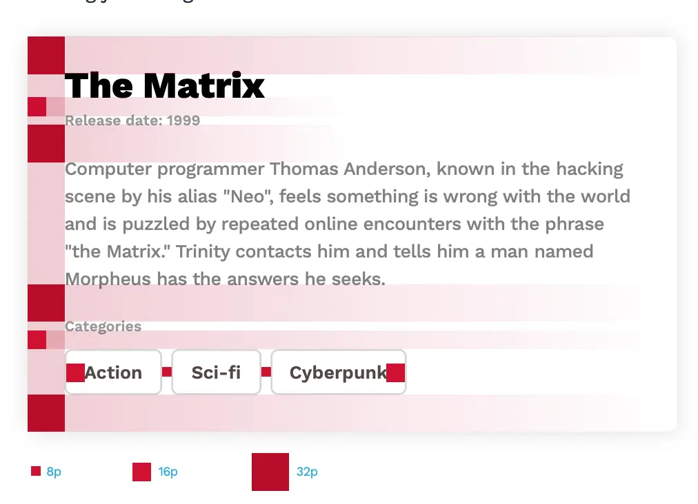
The red square method for grids:
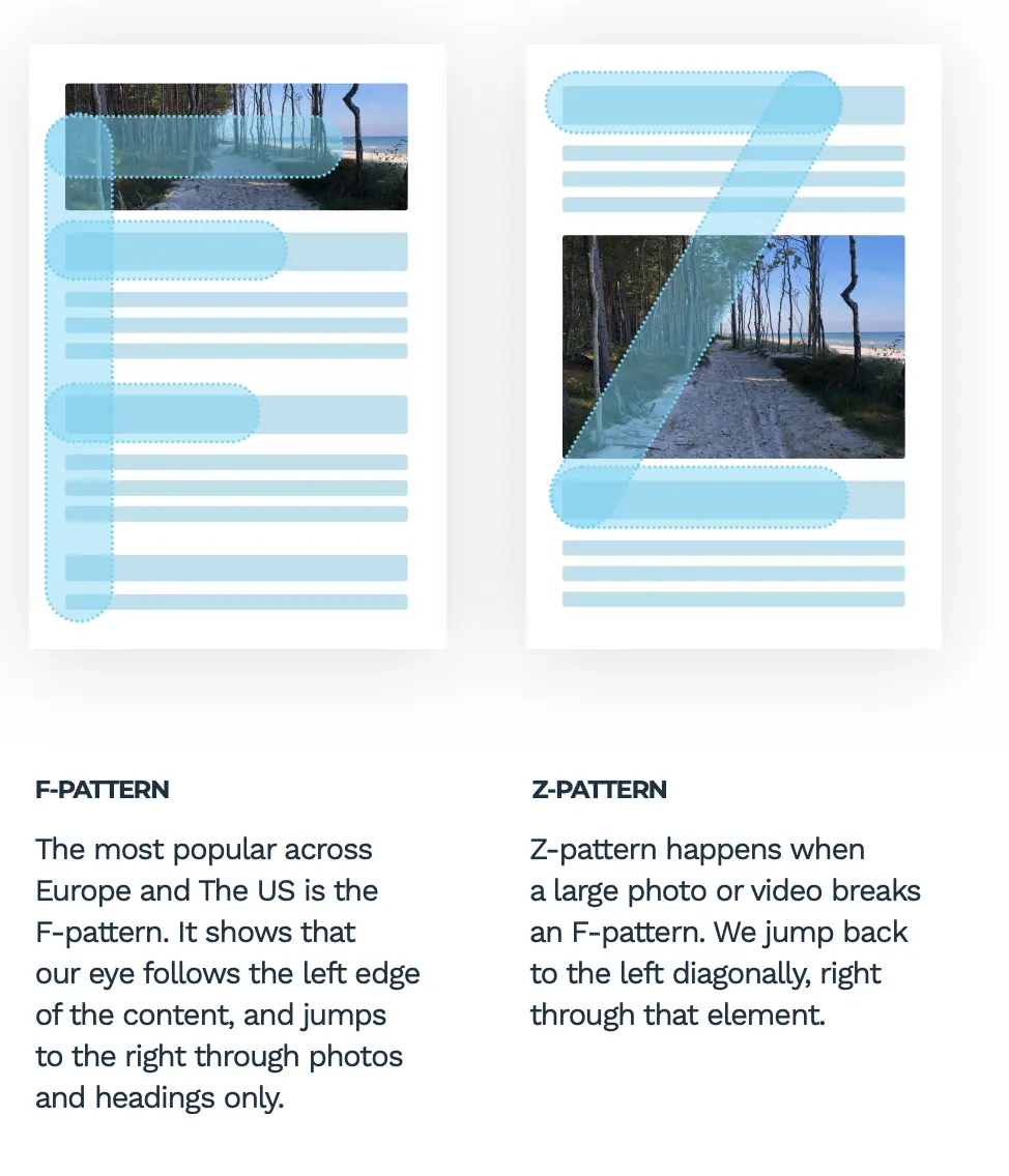
How we look at content:
Color
According to many studies, over 90% of whether we like a product comes from the color palette that it uses. When choosing colors, try to establish the target market, message, and style of your product down to the emotions you want your future users to have when looking at your design.
A typical color palette should contain both neutral and accent colors
Colour palette
Monochramatic = shades of one colour
-
safe bc ddoesnt clast
-
contrast can be lower so design may end up dull
analogous pallette = sit close on colour will
complementy pallets = sit on oppoiste sides of colour wheel
-
high contrast
-
make sure to avoid clashing colours
-
Tip: best way to find matching set is by choosing colours with 85% saturation
triadic = equlturial trinagle on the colour wheel
-
choose tip then pick two bottoms corners
-
colour and playful vibe
-
tip: set your primaly colour as tip, with other two beign complementry
- golden ration: 60% primary, 30% secondary, 10 teritary
split complmeentorary = one colour and then two colours on both sides of columentry hue
-
forms a narrow traingle
-
safe way to acheive really good results
-
goal is right amount of contrast. not too high or too low
greys
-
good idea to create a mix of primary and grey hues
-
if you have a hint of your hue in the grey then it is much easier to make it fit into your design
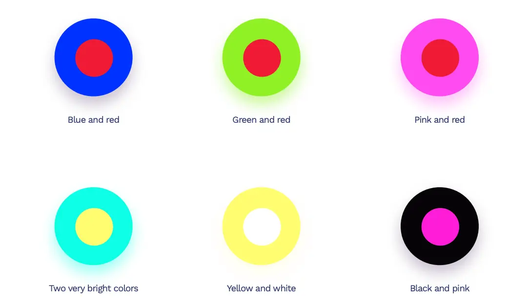
Never mix these colours:
contrasts:
- key readability metric
- high contrast on bright dispaly = strain on eye
- high saturation and high contrast = proceed with caution
- event page or producat page
- but maybe not news portal e store or banking
- Tip: avoid exceed 90% colour saturation until comfartavle enough to choose colour combinations
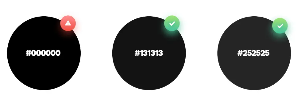
black is unnatural becasue it does not exist in nature
-
why we love gradients:
- we like things that are familar to us i..e nature
e.g. the sky
- everythign we see is graident
- light hitting something creates a change in hue

why we choose gradient?
- create depth
- catching the eye/guiding
why we shouldn’t choose gradient?
- less cluttur
- more moinaml
- more functional
choosing gradients:
- two colours are the easiest
- remember to keep it subtle between the difference in colour
- bad mixes are ones that colours are not ismilar enough e..g warm hues and cold hues mixed wont work